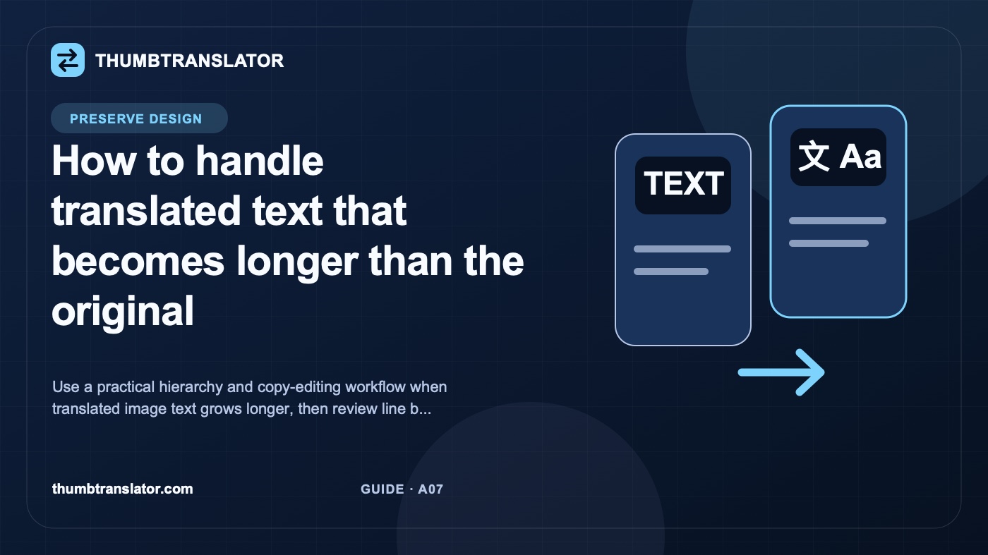
How to handle translated text that becomes longer than the original
Use a practical hierarchy and copy-editing workflow when translated image text grows longer, then review line breaks at final display size.
作者
ThumbTranslator Team
Practical guidance for translating thumbnail and product-image text while protecting meaning, layout, and review quality.
When translated text becomes longer than the original, protect the message hierarchy before changing the typography. Decide which words carry the promise, which details qualify it, and which phrases can be shortened. Then adjust line breaks or layout. Shrinking every word should be a later option because it can make the most important text as weak as the supporting copy.
Treat the problem as both copy editing and layout review. A sentence that fits is not useful if it drops a condition, changes the offer, or becomes unreadable at the size where people will encounter the graphic.
Why translated text expands
The practical issue is simple: a translated phrase may need more horizontal or vertical space than the source phrase. That difference can change line breaks, push words toward an edge, cover a subject, or force several text elements to compete for attention.
Do not rely on a universal claim about which language is longer. The amount of expansion depends on the source wording, the translation, the typeface, the available text area, and the way the message is edited. Review the actual copy in the actual design.
Start by marking the original text area. Note its width, number of lines, relationship to the subject, and role in the hierarchy. Then place the reviewed translation in the same conceptual area. The mismatch tells you which problem you have:
- the meaning needs too many words;
- the chosen line breaks create awkward emphasis;
- the text area is too narrow for this version;
- supporting details are competing with the headline;
- the type is becoming too small at the intended display size.
These are different problems. A single font-size reduction will not solve all of them.
Rank the message by importance
Write a small message inventory before removing anything. This prevents a layout decision from quietly becoming a translation error.
| Message part | Question to ask | Default treatment |
|---|---|---|
| Main promise | What must the reader understand first? | Protect it |
| Subject or product | What is the message about? | Keep it clear |
| Number or named detail | Does it define the claim or offer? | Verify and protect |
| Qualifier or condition | Would removal make the message broader or misleading? | Keep unless a reviewer approves a rewrite |
| Supporting phrase | Does it repeat information already visible? | Candidate for shortening |
Rank each part as required, useful, or removable. Required wording carries the meaning. Useful wording helps, but the surrounding image or title may already communicate it. Removable wording repeats an idea or adds a transition that a short graphic does not need.
This inventory also clarifies review. A translator or native-language reviewer can compare the shorter option with a written list of protected meaning instead of guessing what the designer intended.
Shorten before shrinking
Work through the copy in a fixed order.
- Remove duplicated ideas that appear in both the headline and support line.
- Replace a long phrase only when a qualified language reviewer confirms that the shorter wording keeps the intended meaning and tone.
- Move a secondary detail out of the headline if the layout has a separate support area.
- Try a deliberate line break at a natural phrase boundary.
- Widen or reposition the text area when the design allows it.
- Reduce type size only after the copy and layout options have been reviewed.
| Response | Use it when | Main risk to review |
|---|---|---|
| Shorten the copy | Repetition or optional wording is present | Meaning or tone changes |
| Change line breaks | The phrase has a natural grouping | The wrong word gains emphasis |
| Adjust the text area | Nearby space can be used safely | The subject or balance shifts |
| Reduce type size | The text remains readable in context | Hierarchy and readability weaken |
Complete these copy and layout decisions before rendering the final image. If the translation workflow does not expose text or layout controls, export the result to an editor that does.
Recheck line breaks and hierarchy
Read the revised image in the order your eye naturally follows it. The first line should not end on an unimportant connector while the main noun drops to a weak second line. A protected qualifier should not become so small that it is effectively hidden.
Check the translated graphic against this list:
- The main promise remains the first clear message.
- Line breaks follow meaning rather than filling equal widths.
- Names, numbers, and conditions match the approved copy.
- Supporting text remains visually secondary but still readable.
- No word sits too close to an edge, logo, face, or product detail.
- Outline and shadow do not close the spaces inside smaller letters.
- The new block still balances with the subject and other text elements.
Ask the language reviewer and visual reviewer to work separately at first. One checks meaning and natural phrasing. The other checks hierarchy, spacing, and fit. Compare their notes before accepting the image.
Compare at final display size
A full-resolution file can hide the cost of smaller type. Test the graphic at the dimensions and placements your team actually plans to use. Do not borrow unverified platform dimensions or assume one preview represents every context.
Use a simple release check:
- Open the source and translated versions at the same display size.
- Read each without zooming. Note the first phrase you recognize.
- Check whether the smallest required line is comfortably legible.
- Inspect common crops or overlays from your documented placement workflow.
- Record any difference in line breaks, hierarchy, or covered visual details.
- Revise and repeat until the reviewer can approve both meaning and layout.
AI-translated image text may contain mistranslations, missing text, distorted letters, or layout changes. A generated result should therefore be treated as a draft asset. If longer text cannot fit without weakening the message or making required wording hard to read, rebuild the layout manually rather than forcing the translation into the original box.
相关文章
来自我们团队的见解、更新与故事